
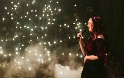
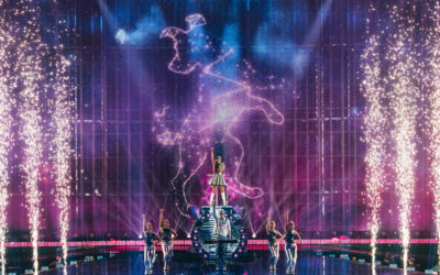
After ten years, the Eurovision Song Contest is getting a revamped version of its logo.
It was only in 2004, as the contest approached its 50th anniversary, that a generic logo was introduced for the first time. Now, shortly before the next round anniversary, the EBU has presented the “evolution” of the Eurovision logo.
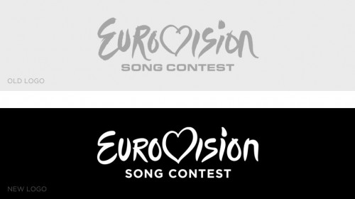
the old and the new logo (EBU)
Sietse Bakker, Event Supervisor of the contest on behalf of the EBU, also revealed what issues existed with the old logo: it “had some challenges; its grungy edges, odd details and loss of detail when shown in small dimensions, particularly the city and year designation.”
After the approval of the reference group, the new logo, which was created by a design agency based in the Netherlands, found its way into the Eurovision world.
The result is a modern, smooth logo that reflects the contest’s “modern classic” nature as well as the ongoing development of our favourite TV show.
Read more about the creation of the new logo on the official Eurovision website:
http://www.eurovision.tv/page/news?id=eurovision_song_contest_logo_evolves
Now it’s over to you: How do you feel about the new Eurovision logo?
[polldaddy poll=8218238]


0 Comments